Iris de
Graaf
Graaf
+31 623 495 625
irisontwerp@outlook.com
irisontwerp@outlook.com
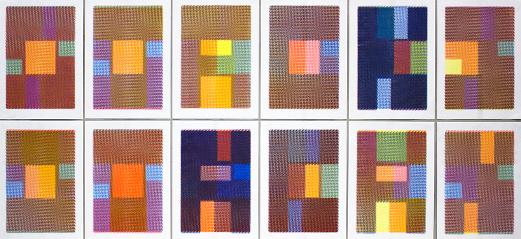
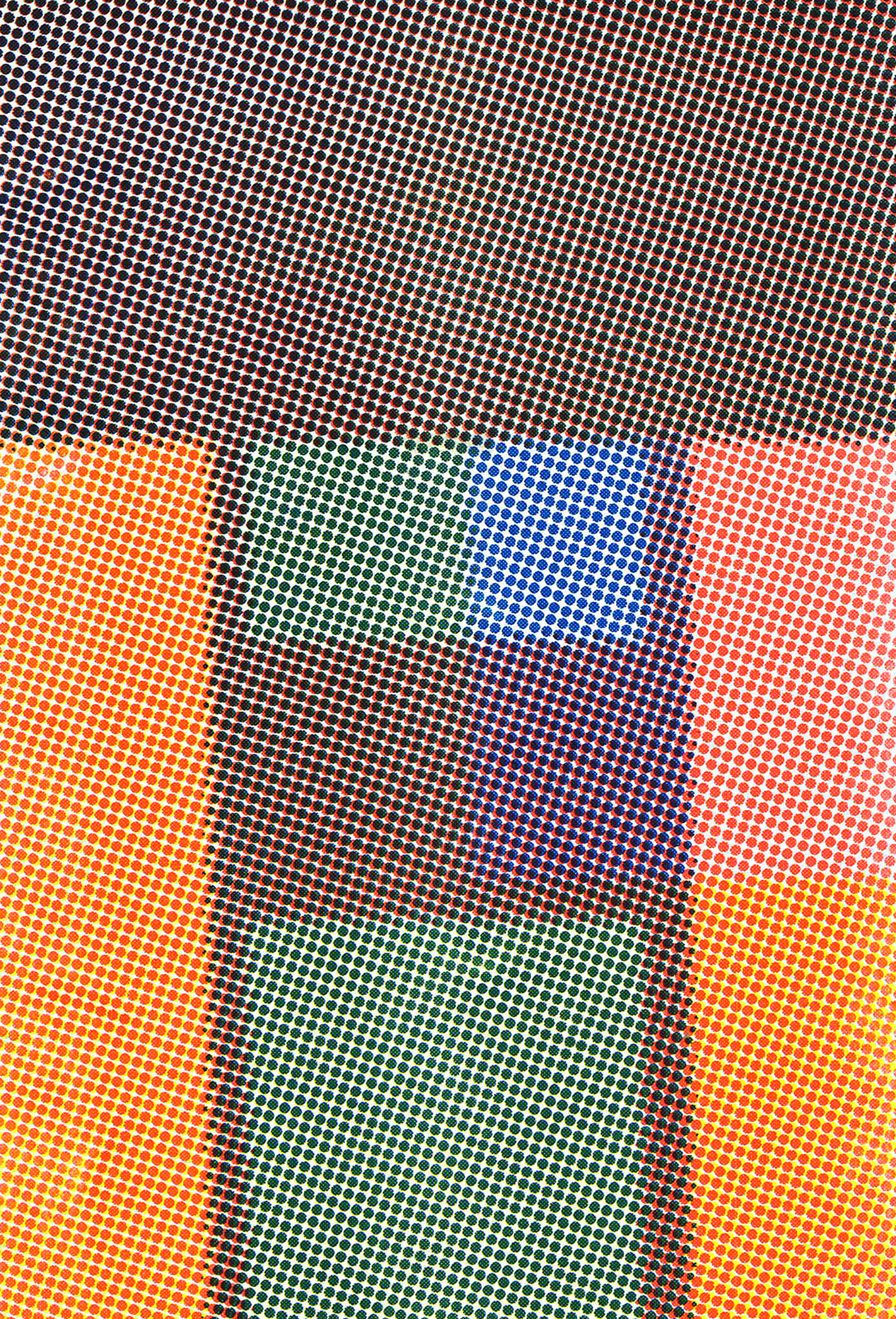
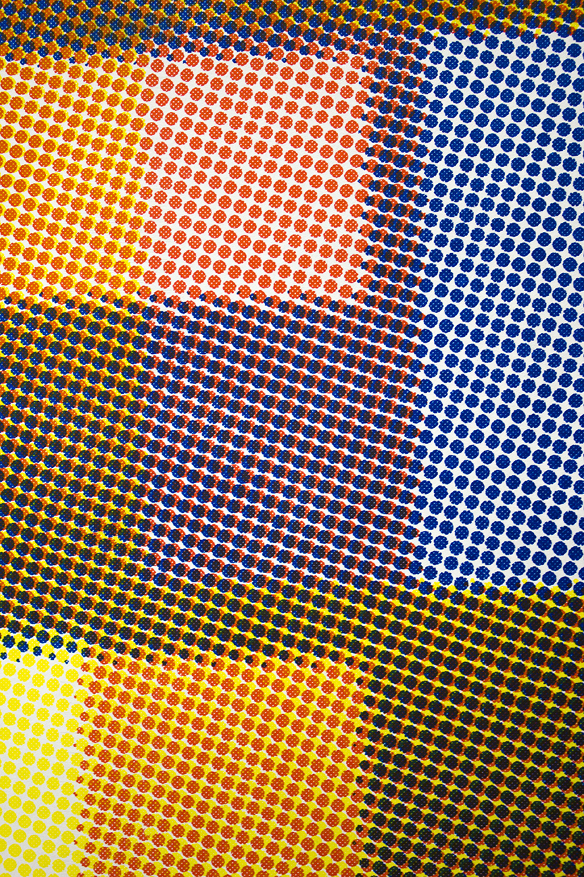
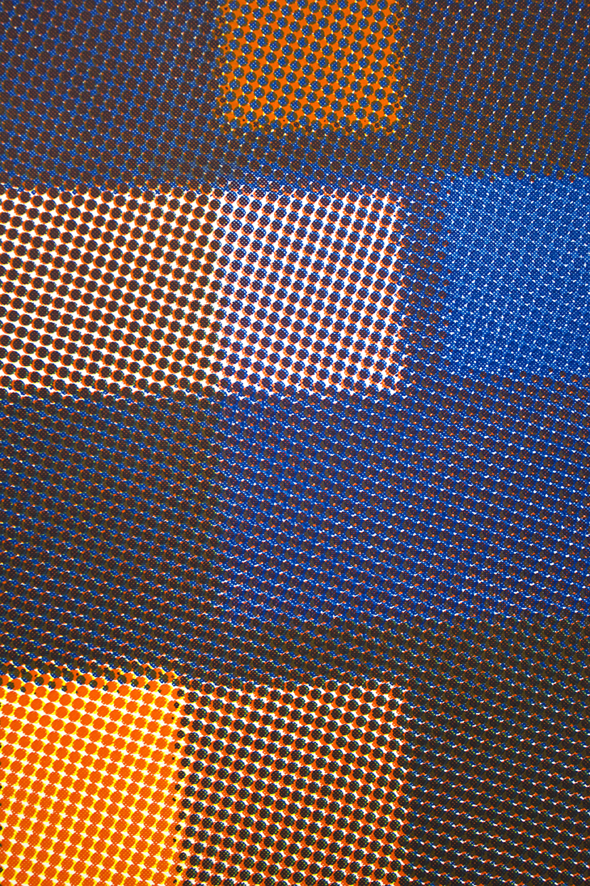
Typographical visual identity for the international book fair: Stacks on Stacks. The concept is based on a systematical layering technique with the Riso printer. With the printing only three toners where used: red, yellow and blue. The letters of the words; stacks on stacks are literally printed over each other creating optical letters and a voracity of colors. The outcome of this technique is a diversity of posters only readable as poster-wall.